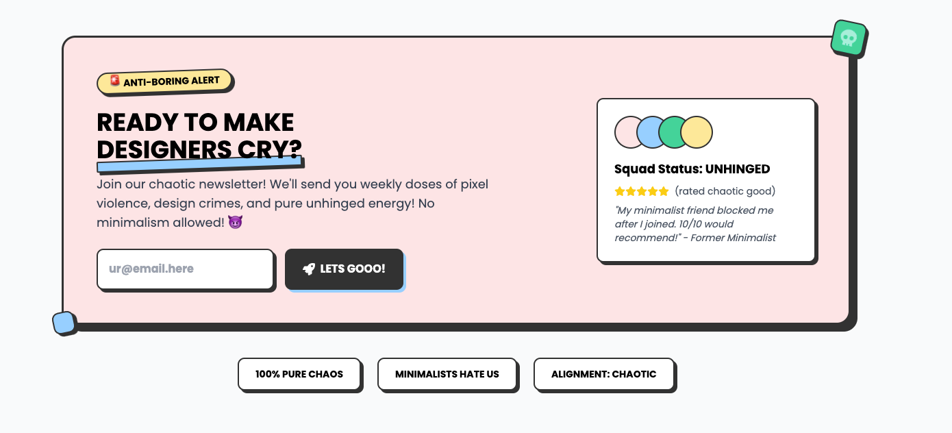
Want conversions? This CTA doesn’t beg—it commands. Make your audience sign up or cry about it later. No hand-holding here.
Say goodbye to dull buttons and hello to the Neubrutalism Buttons—where every click is an event. These aren’t just buttons; they’re statements. With colors that shout and animations that dazzle, each button variant is here to make sure your users know exactly what to do.
Meet the squad that doesn’t play by the rules. Tilted images, quirky quotes, and cards that hover like they own the place—because normal team showcases are just sad.
Highlight your key offerings with grace. Modern animations and radiant gradients draw attention to your features, ensuring your message is clear and captivating.
Why settle for boring menus? Navigate your site like a boss with this neon-infused, retro-futuristic nav bar. Functionality meets cyber-cool aesthetics.
Who needs boring old news when you can have the Neubrutalism News Paper? This component takes the classic newspaper look and gives it a rebellious twist.
Pricing tables that don’t suck. Sharp, bold, and built to make your competition jealous. Take a seat, basic tables, this one’s got personality.
Toast alerts that demand to be seen. Success? Info? Warnings? Errors? Whatever it is, these toasts shout it loud and proud—subtlety not included.
A feature showcase with bold statistics and interactive cards. Each feature includes an icon box, fun statistics, and engaging descriptions with a rebellious tone.
A product page that’s as bold as your branding. Big buttons, loud calls-to-action, and layouts that scream, “Buy it or regret it forever!”
Contact forms with sass. Playful fields, bold social links, and an FAQ section that practically rolls its eyes if you don’t use it. Go ahead, send a message.
Who said heroes need to be horizontal? This bad boy flips the script, making sure your design stands tall and demands attention. Don’t like it? Too bad.
TYPE MATTERS, and this hero proves it. Stark, high-contrast, and unapologetically in-your-face. No gradients, no nonsense—just brutal honesty.
Forget sleek, forget subtle. This navigation bar gets straight to the point—four links, bold typography, and zero fluff. Navigate with attitude.
What do your users say? Let their words float among the stars with this elegant testimonial section, blending trust and aesthetics seamlessly.
BOOM! Make your entrance like a neon explosion. This cyberpunk hero section is all sharp edges, bold animations, and look-at-me-now vibes.
Organize your chaos with a Bento Grid straight out of 2087. Perfect for making your content look structured while still screaming cyberpunk vibes.
Illuminate your website with the Celestial Gradient Hero. Sleek animations and a cosmic glow set the stage for something truly extraordinary. Let your brand shine in the spotlight.
Dive into the void of existential design. This hero is all about embracing the absurd and asking the real questions: Why bother?