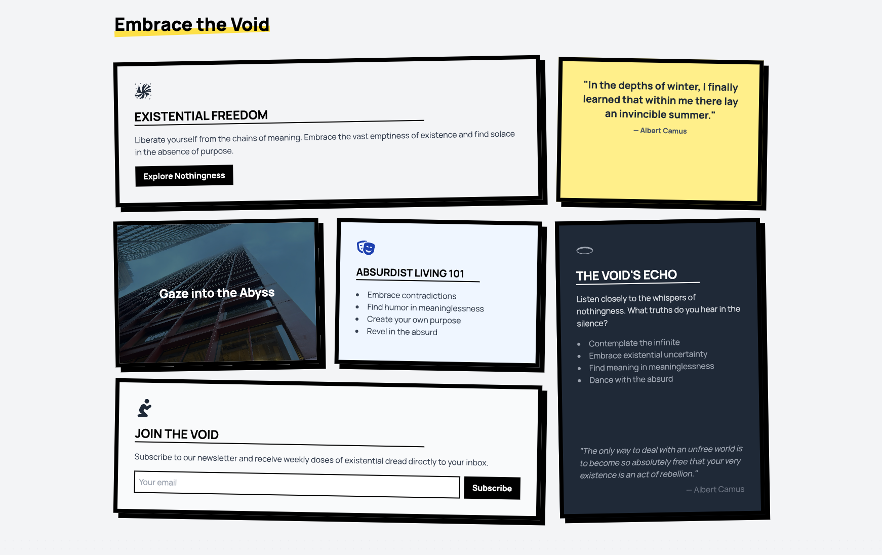
Content doesn’t need to be pretty—it needs to slap. This grid layout is sharp, text-heavy, and dripping with “Absurdist Living 101” vibes.
Forget sleek phone frames—this mockup goes all-in on blocky, bold lines and stark contrasts. Ideal for showcasing apps with zero fluff.
TYPE MATTERS, and this hero proves it. Stark, high-contrast, and unapologetically in-your-face. No gradients, no nonsense—just brutal honesty.
No gimmicks, no fluff—just raw, unapologetic pricing. Bold, minimalist, and brutally honest. Choose a plan or don't—your call.
Data, but make it raw. Stark lines, exposed numbers, and zero polish. This vertical chart is perfect for when you want your stats to hit hard.
No “soft-focus” fields here. Brutalist inputs are stark, clear, and brutally functional. Validation errors? They’ll hit you like a ton of bricks.
Same raw energy, but sideways. Horizontal bars, minimalist design, and enough edge to make your data impossible to ignore.
Forget "features"—these cards are here to highlight the cold, hard truths: nothingness, decision fatigue relief, and existential freedom. You're welcome.
Notifications that don’t sugarcoat it. Brutalist toasts deliver the message loud and clear—no frills, just straight facts (or errors). You can’t ignore them, even if you try.
Dive into the void of existential design. This hero is all about embracing the absurd and asking the real questions: Why bother?
Contact forms with sass. Playful fields, bold social links, and an FAQ section that practically rolls its eyes if you don’t use it. Go ahead, send a message.
No description available
Your typical AI chat interface? BORING! This bad boy packs aggressive shadows, bold borders, and enough personality to make minimalists cry themselves to sleep.
"Elevate your brand!"—because that's what everyone says. But with this animated Venn diagram, we’re actually bringing creativity, strategy, and analytics together. Bold, bright, and way cooler than boring marketing fluff.
Want all your info to look fabulous in one playful grid? Bubblegum Bento is the sassiest way to organize stats, CTAs, and features. It’s giving ✨polished chaos✨.
Visualise crypto market sentiment with informative, visually appealing Glass Sentiment Charts. Add your own real-time data in glossy, easy-to-read graphs.
What do your users say? Let their words float among the stars with this elegant testimonial section, blending trust and aesthetics seamlessly.