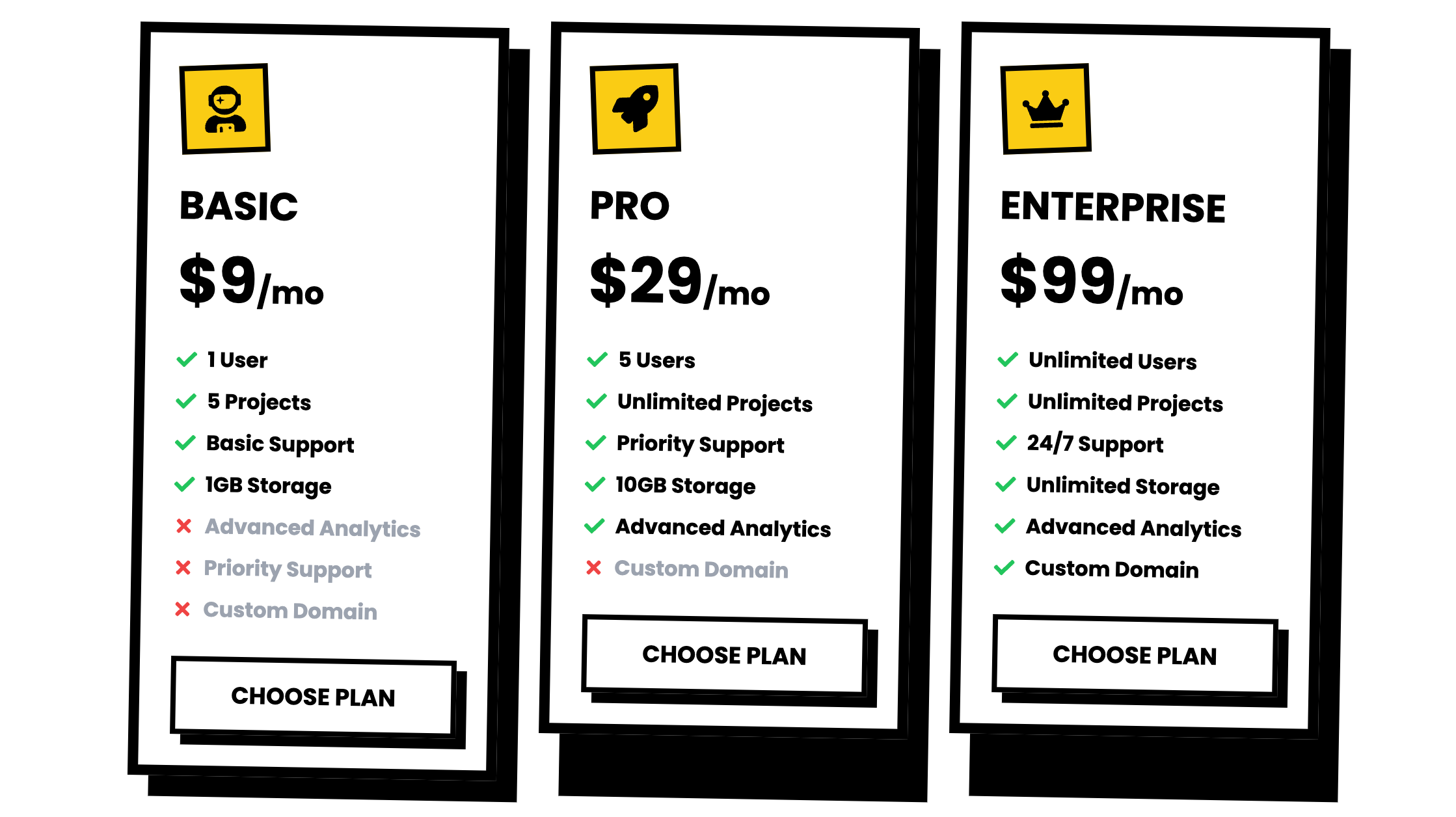
No gimmicks, no fluff—just raw, unapologetic pricing. Bold, minimalist, and brutally honest. Choose a plan or don't—your call.
Forget sleek, forget subtle. This navigation bar gets straight to the point—four links, bold typography, and zero fluff. Navigate with attitude.
Content doesn’t need to be pretty—it needs to slap. This grid layout is sharp, text-heavy, and dripping with “Absurdist Living 101” vibes.
Introduce your site with the Clean Minimalism Hero component. Designed with Tailwind CSS, it offers a clean, responsive layout, perfect for making a striking first impression.
Forget boring ‘About Us’ pages—this one’s playful, quirky, and unapologetically fun. Because your brand deserves more than a dull paragraph.
Play your tracks with attitude. A raw, unpolished interface that screams "DIY or die," perfect for those who want their music as raw as their design.
Showcase your stats like a rebel. No shiny graphics, just raw numbers, bold fonts, and pure brutalist flair for musicians who don’t play by the rules.
No “soft-focus” fields here. Brutalist inputs are stark, clear, and brutally functional. Validation errors? They’ll hit you like a ton of bricks.
Forget sleek phone frames—this mockup goes all-in on blocky, bold lines and stark contrasts. Ideal for showcasing apps with zero fluff.
Notifications that don’t sugarcoat it. Brutalist toasts deliver the message loud and clear—no frills, just straight facts (or errors). You can’t ignore them, even if you try.
Forget "features"—these cards are here to highlight the cold, hard truths: nothingness, decision fatigue relief, and existential freedom. You're welcome.
Buttons that mean business. Whether it’s alternative, warning, or straight-up brutal, these are for people who don’t mess around with UI fluff.
Elevate your UI with our Clean Minimalist Bento component. Crafted with Tailwind CSS, it offers a sleek, responsive design perfect for modern web apps, ensuring elegance and functionality.
"Elevate your brand!"—because that's what everyone says. But with this animated Venn diagram, we’re actually bringing creativity, strategy, and analytics together. Bold, bright, and way cooler than boring marketing fluff.
Organize your chaos with a Bento Grid straight out of 2087. Perfect for making your content look structured while still screaming cyberpunk vibes.
Show off those powerhouse features with style. AI strategies? Check. Data analytics? Double-check. This section is here to make your marketing look as smart as it claims to be.
Why settle for boring menus? Navigate your site like a boss with this neon-infused, retro-futuristic nav bar. Functionality meets cyber-cool aesthetics.
BOOM! Make your entrance like a neon explosion. This cyberpunk hero section is all sharp edges, bold animations, and look-at-me-now vibes.
Showcase pricing with style using our Clean Minimalist Pricing component. Built with Tailwind CSS, it combines minimalism and responsiveness for a seamless user experience